
Overview
Orange: Visual Programming
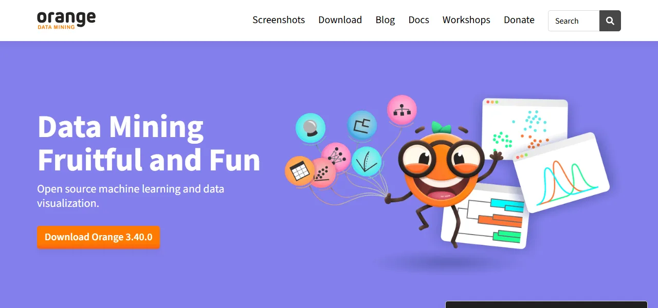
Data scientists and educators across the globe rely on Orange to streamline their data analysis workflows, thanks to its visual programming interface that eliminates the need for coding. With Orange, users can place widgets on a canvas, connect them, and load their datasets to garner insights, making it an ideal platform for hands-on training and visual illustrations of complex data science concepts. The tool offers a range of interactive data visualization options, including statistical distributions, box plots, scatter plots, decision trees, and hierarchical clustering, allowing users to make sense of even their most multidimensional data. Orange also features specialized extensions for natural language processing, text mining, network analysis, and more, which can be used to perform tasks such as time series analysis and gene expression analysis. However, one limitation of Orange is that it currently lacks a built-in capability for real-time data streaming, which can make it less suitable for applications that require immediate data processing. Despite this, Orange remains a versatile and powerful tool, with a range of resources available, including YouTube tutorials and a blog that showcases its applications in various fields, from exploring Slovenian houses to analyzing RNA-seq data. With its open-source machine learning and data visualization capabilities, Orange has become an essential tool for anyone looking to explore and understand complex data sets, and its extensions and community support ensure that it will continue to evolve and improve over time.